Documentation
Index
Tutorial
When you first use the program, it's best if you follow the short tutorial, which will explain the different sections of the interface. You can also start it from the Help menu.
Font Metrics
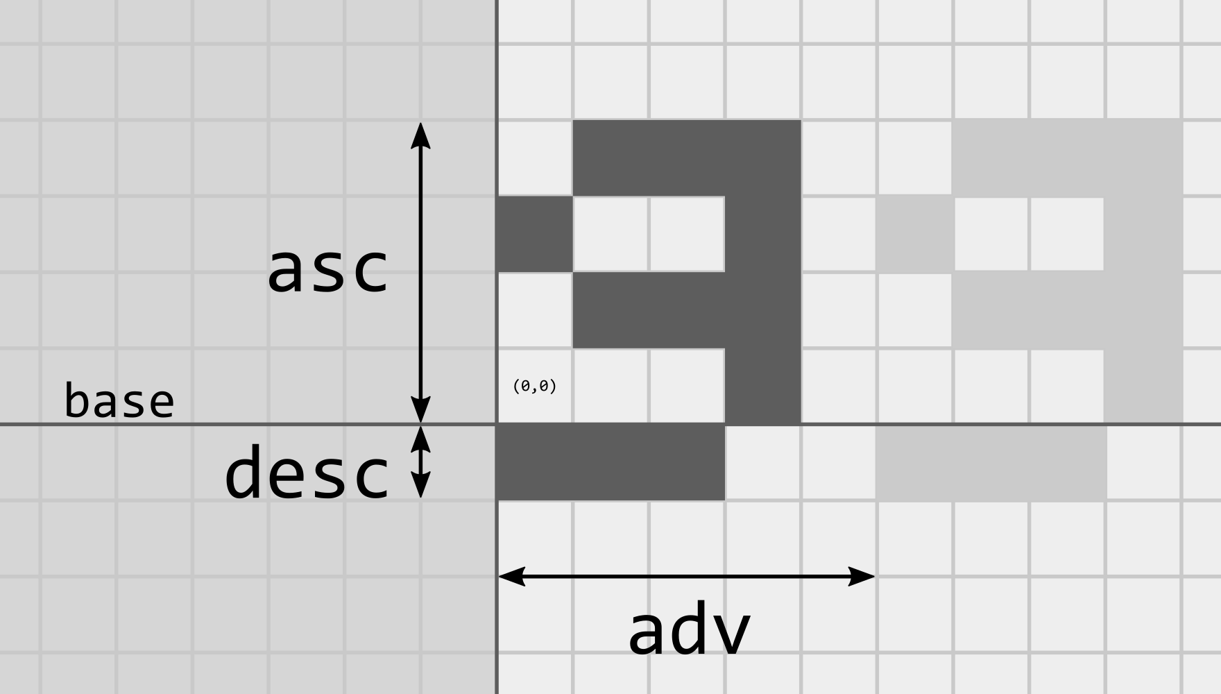
The baseline marks the height where the characters (a.k.a. glyphs) are drawn. Pixels can be above or below the baseline. Ascent is the height from the baseline to the top of the character, while descent goes to the bottom of the character. In the example, ascent is 4 while descent is 1.
The font is anchored at the origin, the (0,0) pixel. Advance is the horizontal jump from the origin of this character to the origin of the next one. It's a property of each character, and will define how close together or far apart they are from each other.
Pixels can also be drawn to the left of the origin. They usually aren't (which is why the area is shaded in a darker color), because that might make them overlap with the previous character, but it's desired in some situations.
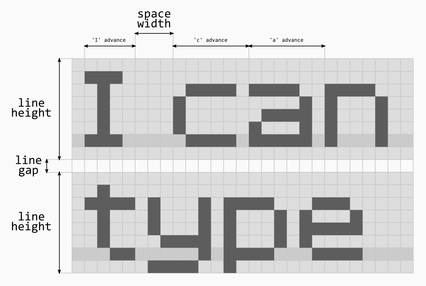
Line height is determined by the size of all of the characters in the font. It's automatically calculated as you edit the font.
Line gap is an extra distance between one line and the next. You can set it in the font properties window.
Space width is the advance of the "space character", it behaves just as the advance of any character. You can also set it in the font properties window.
Main Interface
Editor
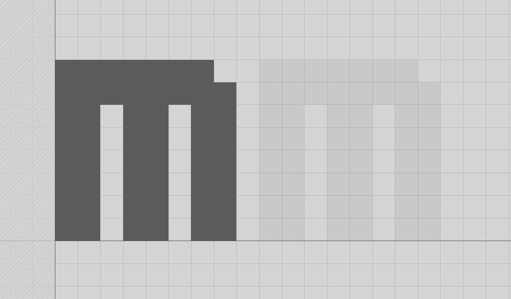
The main area where you draw and erase pixels for each character. Once you have drawn something, to the right of the character there's a shadow of itself. This will help visualize how the Advance setting (see the Font Metrics section) changes the spacing with the character drawn after it.
Controls:
- Left Click: Draw pixel
- Right Click: Erase pixel
- Middle Click: Pan view
- Scroll: Zoom
- +/- key: Zoom

In the status bar you can see the mouse coordinates, the size of the glyph, and the current zoom level.
Glyph Properties
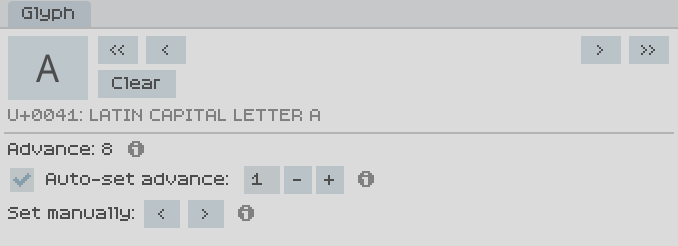
Here you can see the properties and settings of the current character.
Navigation
The and buttons (also with Left/Right keyboard keys) will switch to the next and previous characters as sorted in Unicode.
The and (also Ctrl-Left and Ctrl-Right) will do the same but will skip characters that haven't been created yet, so you'll just jump to the nearest existing character in that direction.
Clearing
You can delete characters in the font, which is necessary even if you delete all the pixels for that character. Otherwise, those characters would still be existing and "drawn" when typing text with the font.
Advance
As seen in the Font Metrics section, advance specifies how many horizontal pixels will be skipped in order to start drawing the next character. There's two ways of setting advance:
Auto-set advance: With this setting, you specify how much space you want after the character, counting from the right-most pixel. This is useful if you're editing the pixel and don't want to worry about manually setting advance for it.
Manually: You can directly control advance if you want to do something special like forcing the next character to be closer or further from this one. This overrides the automatic setting.
Character Set
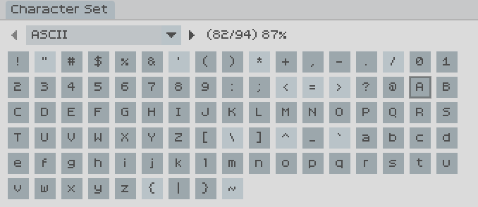
Here you choose which range (a subset of Unicode) you're currently editing, and you can select the character within it. There's overlap within subsets, since some of them are Unicode blocks, while others are third-party subsets (e.g. Google Fonts, Adobe Latin, etc.).
Characters are shaded depending on whether they are present in the font or not.
Text Preview
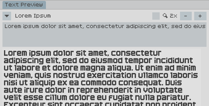
In order to see the characters you've created in context, the Text Preview shows you a text rendered in the font you're editing. It updates in real time as you add/remove pixels for characters.
You can choose between pre-made texts (mostly pangrams in different languages), typing your own, or the special "All Glyphs" which contains all characters present in the font, plus it updates with new characters automatically.
You can zoom the preview image in and out, and there's a checkbox for showing the vertical metrics as the background (see the Font Metrics section). In dark gray there's the baseline, lighter gray above and below for ascent/descent, and white for the rest of the image (useful to see if the line gap is what you expect).
Document switching
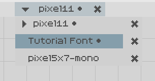
You can switch between open documents both by cycling through them using Ctrl-Tab or Shift-Ctrl-Tab, and by clicking on the font name on top and choosing a different font.
An arrow points to the current document, and a circle after the title marks whether the document has unsaved changes.
Font Properties
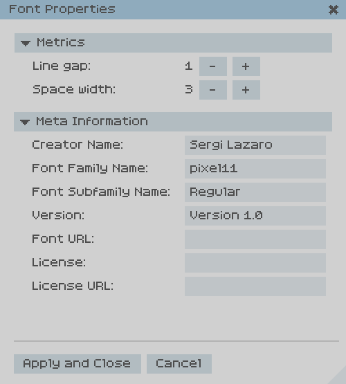
Here you can change global font properties like line gap and space width (see the Font Metrics section), and all the meta information that will be embedded into the exported TTF file.
Importing TTF
If you want to edit a font that was previously generated with a different program, you can try to import it to PixelForge.
The importer will automatically try to guess which is the font size that corresponds to the pixel-perfect rendering of the font.
In order to be successfully imported, the font has to be a "true" pixel font, meaning that at some specific integer size it's rendered as fully black or white pixels, no intermediate grays. Therefore, the importer won't work with any arbitrary font, only with ones that would render as a pixel perfect font.
If you have a TTF font that is actually a pixel font and should be imported but the importer fails, it would be appreciated if you could share the TTF file in order to improve the importer.
Exporting TTF
Exporting is simper than importing, since the program starts with a known pixel font, so the vector data is generated from it.
If you find any problems with the TTF files generated by PixelForge, it would also be appreciated if you could share the PXF file to improve the exporter.
Crash reporter
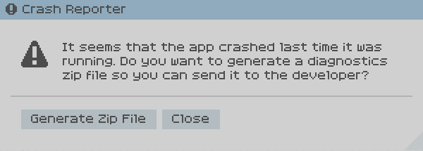

Whenever the application closes unexpectedly (meaning not by closing the window in the normal way), the next time you open it, you'll have the opportunity to generate a diagnostics zip file that can be shared in order to figure out possible bugs in PixelForge.
